Plates as beans
Eight directions for the mark, each drawn in a single colour and shown at real favicon size. The idea was already in the placeholder: stegosaurus plates and coffee beans are the same shape.
Three sheets from the identity work, published as they were made. Each one shows the rejected options alongside the chosen one, because the discards are most of the argument.
Eight directions for the mark, each drawn in a single colour and shown at real favicon size. The idea was already in the placeholder: stegosaurus plates and coffee beans are the same shape.
Where the mark was settled. Also where the tail spikes were tried eight ways and abandoned — they read as a bird, a fish, or a palm tree, never as spikes.
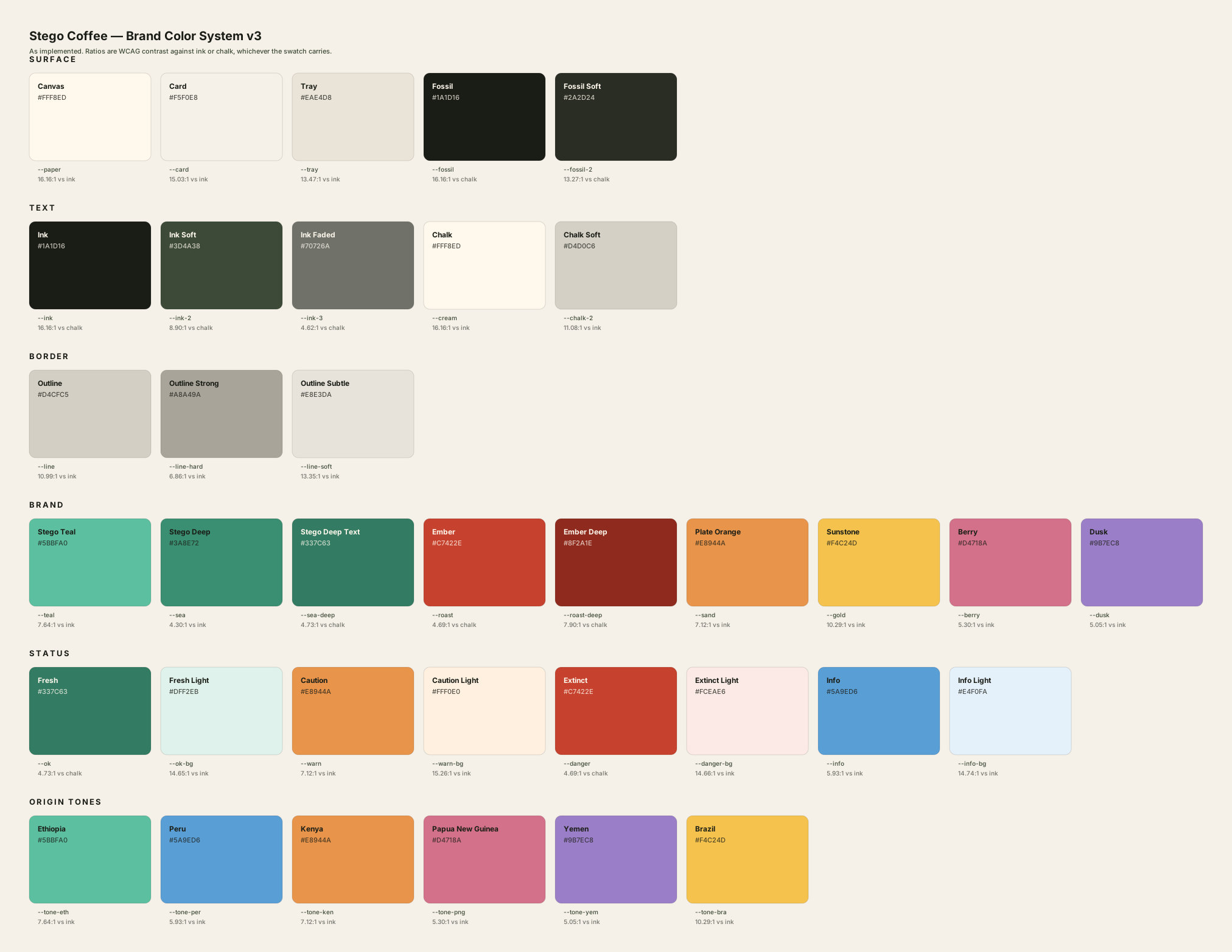
The palette this site now runs on, sampled from the cover of M83’s DSVII, painted by Mœbius. Eighteen colours with their true share of the canvas.
Six steps from the mark to a cute game-sprite stegosaurus, one change per step, so the question stops being a matter of taste. Legs are the cheapest borrow; a mouth is the line.
Three problems between “add a tail” and a tail that actually reads — and the two numbers that fixed it, both found by drawing the range rather than deriving it. Explored, then set aside — the original mark stands.
The brief used to forbid looking like a children’s dinosaur brand. The direction is now deliberately warm, so it asks for warmth instead — and still rules out a mascot.
Drag straight onto a Figma canvas. Every swatch arrives as a named layer with its hex, its token name and its contrast figure.
W3C design-token format, grouped and described. Reads into Tokens Studio or any variables-import plugin.
Name, hex, CSS token and contrast on one line each, for pasting anywhere that isn’t a design tool.
The one measurement worth carrying off that last sheet: 82% of Mœbius’s canvas sits within twelve lightness points of its mean. He holds tone almost flat and lets hue wander, then spends the entire contrast budget on the linework and a single insect.